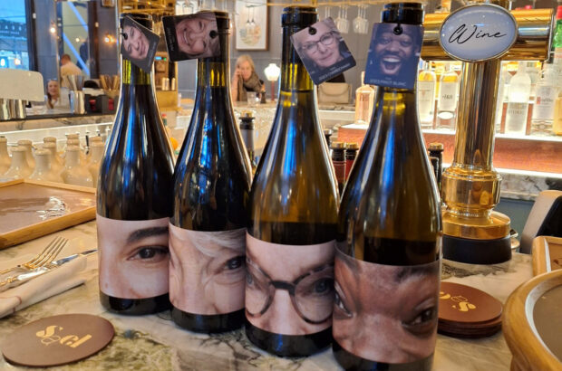
Most shoppers judge a wine by its label and choose accordingly, so it is essential for producers that they get it right. ADAM LECHMERE learns about the importance of label design.
Let’s get one old chestnut out of the way before we go any further: it is incontrovertibly true that people can and do judge a book by its cover, and a wine by its label. For all but a handful of world-famous wines, the label design is as important as the wine. Modern wine label design is a sophisticated, complicated process.
‘There are thousands of wine brands,’ says Paul Foulkes of design agency Wren & Rowe. ‘It’s a never-ending source of work. We’ve done 600 labels over the last five years. At any one time we are working with eight or nine wineries.’
Wine label are both similar and very different from other areas of design. Wren & Rowe, for one, designs other types of packaging, such as soup cans for Baxters, which are subject to some very different disciplines. ‘With food packaging the key thing is impact on the shelf,’ Foulkes says. ‘So things like instant recognition and logo differentiation are vital. Wine is different. The wine aisle in a supermarket is more crowded – because people slow down when they get to the wine. They pick up the bottle, have a look at the back label design. They think about it.’ And what they think is: ‘What is this wine going to do for me?’ or ‘What is this wine going to say about me?’
Those who research this sort of thing have come to the conclusion that buying a wine above a certain price point in a supermarket is very much a lifestyle choice.
People have very strong ideas about what a label says. ‘That looks like an expensive label’, one will say, or, ‘with that label I would take it to dinner party’.
UK consumers are canny and sophisticated, most designers agree, but they also work on engrained assumptions. Stranger & Stranger, a Soho-based design partnership which did the exquisite label for Clos de los Siete (the Argentinian super-cuvée run by Michel Rolland and a clutch of Bordeaux grandees), Gran Lurton and others, does its research by accosting people leaving supermarkets and quizzing them on their purchases.
Autosuggestion is a powerful force. The company’s Kevin Shaw remembers one person tasting a wine called Orange Tree from South Africa. ‘He was saying, “mmm, you can taste the orange in the wine”.’
And as there seem to be no hard and fast rules, he loves to push the boundaries. ‘There is no orthodoxy,’ he says. ‘You can put anything you like on a label. A fish, a chair, a pair of shoes.’
One of Stranger’s most striking designs is for Le Grand Noir, an Aussie Shiraz. A black sheep is simply etched onto the black bottle, with a gold woodland surround. It looks expensive and slightly decadent – the sort of thing the Marquis de Sade might have on his table.
https://www.decanter.com/premium/australian-shiraz-panel-tasting-results-393966/
‘What we find is that people look for any sort of clue on the label. They want something to hang their hat on. If it’s something that they have already ascribed values to then it makes the buying process easier.’
That is why you see so many of the more expensive labels carrying images that may seem totally unrelated to wine: a sheep, for example. Shaw says animals seem to work particularly well – though he admits he can’t quite understand why.
Or take South African winery Boekenhoutskloof’s ‘Seven Chair’ label (designed by South African Anthony Lane) – one of Shaw’s favourites. ‘How did that come about?’ Shaw asks. ‘You might think, what have chairs got to do with wine?’
Mark Kent, winemaker at Boekenhoutskloof, explains the connection: ‘Boekenhout is a Cape beech tree which in the late 18th century was widely used for furniture. Those are seven period chairs, and there are seven partners in the business.’
Forget the seven partners/seven chairs bit – the most important thing is the signal: this winery has history. The chairs are telling the consumer, this wine is as handmade as those chairs obviously were, and what’s more it’s as much a part of the land as those beeches.
Paul Foulkes agrees that heritage, and geography, are essential for top-end labels. The best wines are rooted in their terroir. ‘You have to show the estate, that the wine’s not from a factory. You have to give the wine a reason for being in the place it is.’
Kent explains how they take the handcrafted concept even further. Each label is ‘hand-torn, and applied by hand’. Buy this wine and you might as well be in the winery directing operations yourself.
Occasionally a winery takes the handcrafted bit too far and comes up with something that is just confusing.
‘The label should be informative,’ says Conran Design Group’s executive creative director David Pocknell. ‘If you have to read the back label to see what the wine is, that’s crazy. Too much overt styling is self-defeating – you begin to be suspicious of the wine.’
Label design may well be an art, but it mustn’t be forgotten that we are talking about an industry that is bigger than cosmetics or music. Getting someone to pause long enough to pick your wine off the shelf is a deadly serious business.
So it’s a science as well as an art – or, as Foulkes suggests: ‘Chess is a good analogy. Like chess, there are limited moves, but each one has millions of ramifications. There are moves where you block the opposition, and moves where you attack.’
You might want to do something radical, but will that take the brand out of its category? If you go traditional, will it appeal to the right market segment?
As an example, Foulkes says the rebranding of Rioja’s Lagunilla was a textbook blocking move. The wine wasn’t doing well, so they decided to give it a classic makeover using traditional elements borrowed from other Rioja labels, such as a crest, and a block of text in Spanish.
In fact, designers (even the Soho-based ones) will often err on the side of tradition. They never lose sight of the fact that wine is a very conservative business.
‘Traditon is very, very important,’ says Shaw. ‘I use the vinyl/CD comparison – the old records somehow have more soul than perfect, digitally remastered CDs.’ It’s the same with labels. A computer design gives you digitally exact spacing between letters, whereas the old typesetters were more asymmetrical. As Shaw points out, this is more satisfying because there is no symmetry in nature.
‘It’s nice to have errors,’ he says, pointing to Château Mouton’s label, and – a personal favourite – Marqués de Murrieta’s Castillo de Ygay.
‘They have both evolved over the years – and they are slightly off centre. Ygay breaks all the rules. It shouldn’t work. It’s got nine different fonts, it’s incredibly busy, but it was crafted by old-fashioned engravers so it has the feeling of being created by someone who really cared, and knew, about what he was doing.’
There is a fine line to be drawn between caring – and trying too hard. Alex Ashworth of marketing agency WineMarque warns against those who design labels to win competitions.
‘Design innovation can be more about fulfilling the taste or awards agenda of the agency rather than putting the strongest consumer proposition on the shelf,’ as he puts it.
Ashworth points to some examples of particularly flashy design – the ‘lenticular’ label for Lotengo wine from Argentina (one of Stranger & Stranger’s more outre efforts), whose image moves depending on the angle you see it from. ‘That’s an incredibly expensive label – and where is the wine this year?’
This brings us back to the essentially conservative nature of the wine buyer. ‘You can shrinkwrap a bottle in silver foil and people will be attracted to it once, but they won’t come back. If it’s too novel it won’t sell,’ says Foulkes.
So, it’s simple really. Desiging a wine label is a science, an art – and a game of chess. All you need to do is persuade the consumer that by buying your wine he is proving himself an individual.
In the end, wine is a fashion statement for many people. As Shaw says, ‘People want to feel represented by the wine they buy.’
The experts’ critique:
THE critics: We asked two design experts for their opinions of a range of labels – Mike Taylor of Hopkins Architects, the creative force behind such projects as the British Antarctic Survey station at the South Pole, and David Pocknell of the Conran Design Group
THE winery: We also asked the wineries to put forward their reasoning and the history behind the designs.
First growths
Chateau Lafite Rothschild
MT: The drawing is given prominence over the text, and on closer inspection you note that the couple of aristocratic women leisurely strolling through their estate are in fact about to walk past two hard-working male estate workers. Bucolic idyll or Lady Chatterley’s Lover? Curious and charming.
Winery: This label was designed in 1924, but previous labels were not very different. Using a view of the château is a long tradition in Bordeaux.
Chateau Latour
MT: Calm and confident, the type is elegant and is not afraid to leave large areas of white. The tower and lion suggest power and strength. Reassuringly in control.
Winery: The label has been almost the same for more than 130 years. No one knows exactly what the lion represents but it could have a link with England.
Chateau Haut-Brion
MT: The clumsy drawing of the château makes it look like a deserted baronial pile. The text is a mess – five different typefaces; the date is stamped and the details are in fake handwriting. Not immediately inviting.
Winery: Unchanged since 1898. Like the wine, the label is classic and classy. The message we want to put across is ‘class, not fashion’.
Chateau Margaux
MT: The elliptical woodcut image looks a bit dreamy, like a Magritte woodcut of a doll’s house, and is slightly at odds with the more serious Old World typeface of the curving titles. Nonetheless, the composition is very clear but manages to also be enticing.
Winery: Apart from a few minor changes the label has stayed pretty much the same since the end of the 19th century. Perhaps its restrained and elegant style reflects the character of the wine so well there has never been any reason to change anything.
Chateau Mouton Rothschild
MT: Does Kabakov’s drawing show the view from inside an empty bottle? Any implied psychedelia is countered by the imposingly regal style. Looks like they are trying for aristocratic authority and modern creativity at the same time. Too curious not to try.
Winery: Artists appearing on the Mouton label since 1945 (when Baron Philippe de Rothschild first commissioned an original work) include Picasso, Miro, Dali, Henry Moore, Chagall, Warhol and Francis Bacon.
The experts critique:
New world
Ridge 2001
DP: I know of this wine’s fabulous reputation and I rather like the austere labels. They have a kind of stark authority and look really quite elegant. I think I would understand that even if I did not know the pedigree.
Winery: Our label on the 1962 Monte Bello may have been the first commercial use of the elegant Optima typeface in the United States. The label has been very successful for us and we continually receive compliments from customers for its clarity and the information it provides. On a shelf with other wines it can be recognised at a distance.
Setanta
DP: The new Blue Nun! The illustration is folksy and the legend is rather drippy. Why do winemakers use this vehicle to try and convince the buying public that a story is worth a thousand bottles? Really nasty in this context.
Winery: The label design, first used in 2001, is intended to portray quality, elegance, and perhaps introduce some subtle romance. By its striking colour and content, it is bound, more than occasionally, to become a topic of conversation.
Kenwood, Jack London series
DP: Ugh! Would have been no better if they had used a human skull! This would put me off, and no amount of curiosity would make me buy it.
Winery: The dramatic etched wolf’s head logo on the bottle has created tremendous consumer interest and recognition for the wines. The wolfhead was Jack London’s bookplate logo for many of his novels and is used to embellish the character of these unique wines.
Pahlmeyer
DP: So, so elegant. However it is a little pompous. I hope the wine is very, very good because that degree of surety suggests very high quality.
Winery: The sensibility of the new design (from 2000) is that of simplicity – understated elegance. We were hoping to achieve a classic timeless design, reminiscent of turn-of-the-century Bordelais packaging.
Montelena
DP: I have a problem with the New World trying to be old! Although the vineyard was set up in 1882, I’m not sure I think this is the way to go. Ridge seems more honest somehow.
Winery: The Chateau Montelena is strongly associated with the winery’s identity, because it represents the winery’s long history, and its image reflects the classic style of our wines. This drawing (from 1974) connotes stability, dependability, staying-power, heritage and Old World tradition. The vanishing lines of the building, when viewed from the side or straight-on, are easily identifiable.
Old World
Doccio a Matteo
DP: This manages to say the name three times and you still can’t read it. Crazy. This kind of overt styling makes you suspicious of the wine. The label has a job to do. This one isn’t doing it.
Winery: In 1993 we decided to try a label to attract female buyers – the words were written by an old worker here: the idea is to attract people who are interested in discovering new wines out of the control of the big corporations.
MAS DE Daumas Gassac
DP: I don’t like the coloured version as much as the old black and white one, which I love. It had a personality of its own.
Winery: My mother selected a spot from which you can see the three most important features of the estate: the house, the landscape and the vineyard. A friend, Mme Galatée Brun, came up with the drawing, and it was first used in 1978.
Don Vincenzo
DP: This is just horrible. What is it? I can’t see what the faces are – is that a boy or a woman? And those weird squiggles. This has nothing to recommend it.
Winery: The two profiles are Vincenzo d’Orsi, the father of Giovanni Battista d’Orsi (the current owner of the estate), and Giovanni’s son, Vincenzo, representing the beginning and hopefully the future of Casaloste. Giovanni put his signature between the two profiles to represent the link between the two generations.
Chateau Siran
DP: Very kitsch. Horrible. I hate photos on wine labels, the typography is too muddled. A mess.
Winery: The theme for the 1999 was the age of splendour in Rome 2,000 years ago. To celebrate this anniversary, we chose the image of the famous red marble ‘drunken Bacchus’ stature from the villa Hadriana.
Clos de Breuil Moutlouis, Domaine Francois Chidaine
DP: Now wouldn’t you like that on your table? I love it. I suspect it is a modern version of an old label
Winery: We wanted the label, first released in 1999, to reflect our wines – their purity (the sober and refined design), finesse (the delicate lettering) and conviviality (the cream and dark brown colours).


